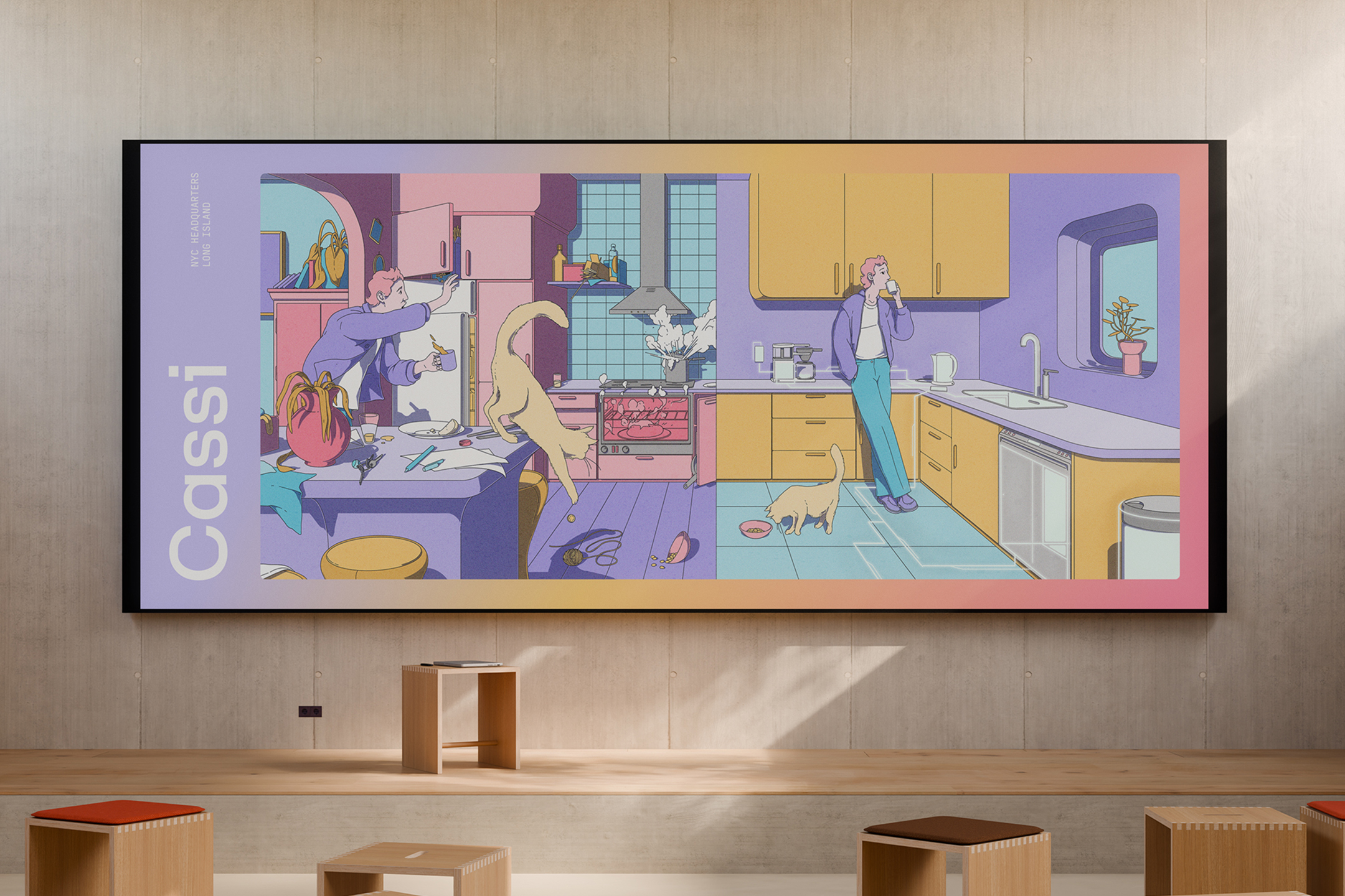
Using the brand to dictate the product feel, the brand world took on a biological symbolism, with Cassi acting as the central nervous system within your home. The color system pulls you from nostalgia to high-tech modernism, in all the best ways. The logomark represents a radiating heart, with variable simplifications for product storytelling. The logotype balances rounded counters with straight terminals to further build on the tension between human understanding and world class technology.
Our typographic system features Gestura for display, a sharp serif built on class and authority, pulling inspiration from 16th century old style tradition. As a lot of tech brands hastily slap on warm flowy serifs to communicate "friendliness" which often feels expected and basic. We selected Gestura to communicate an editorial inspired self-assurance. Our subheading typeface, F37 Lineca, a concept-driven typeface flexible at small and large sizes.
With an earlier emphasis on B2B before shifting into predominately B2B, we strategized a brand that could be fluid in nature, stretching across audience segments without losing the characteristics that are unique to Cassi. To further solidify this and help the Cassi team going forward, we built out a robust messaging and tone of voice framework that allows Cassi to flex from a homeowner audience segment, all the way to upscale property management companies without losing its special touch.
The entire system is pulled together with editorial-style illustrations done by Micha Huigen. The brief we gave to Micha was no small task - create an illustration set that could work on web, product, social, animation, and so on, but also can get hung up on the wall in your living room and look like fine art. Micha did not dissapoint.